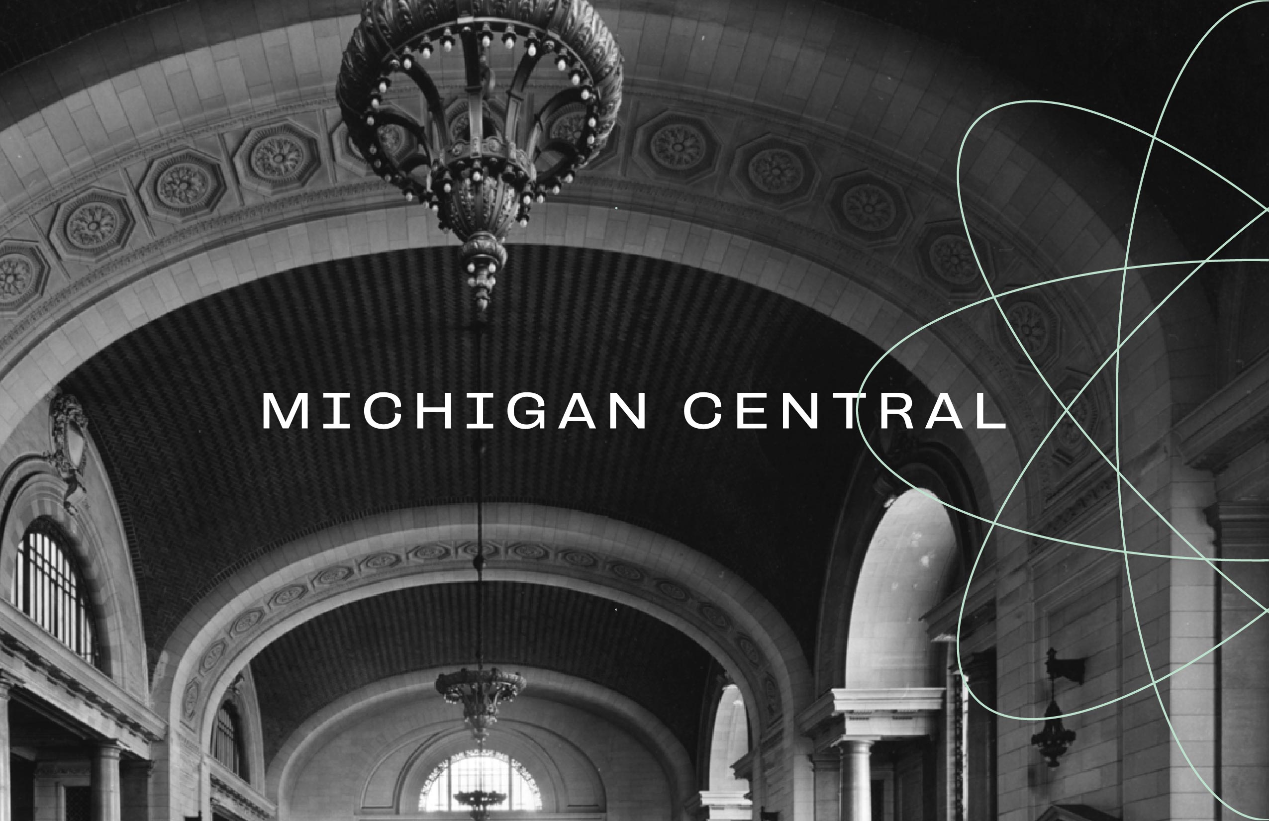
Michigan Central Station
2020
Client Ford Motor Company
Type Branding Exploration
While working as an in-house art director and designer at a NYC based creative agency, Civic, I was asked to generate visual identity options for Ford’s Detroit based Michigan Central Station. Designed by the same architects responsible for Grand Central Station in New York City, Ford is currently refurbishing the landmark with plans to convert the space into the company’s International HQ and a hub for community engagement. In the brief, Ford asked for us to push the boundary of Ford’s conservative visual identity into a contemporary space, incorporate new color palettes to revitalize their iconic blue, and emphasize their history of innovation.
1
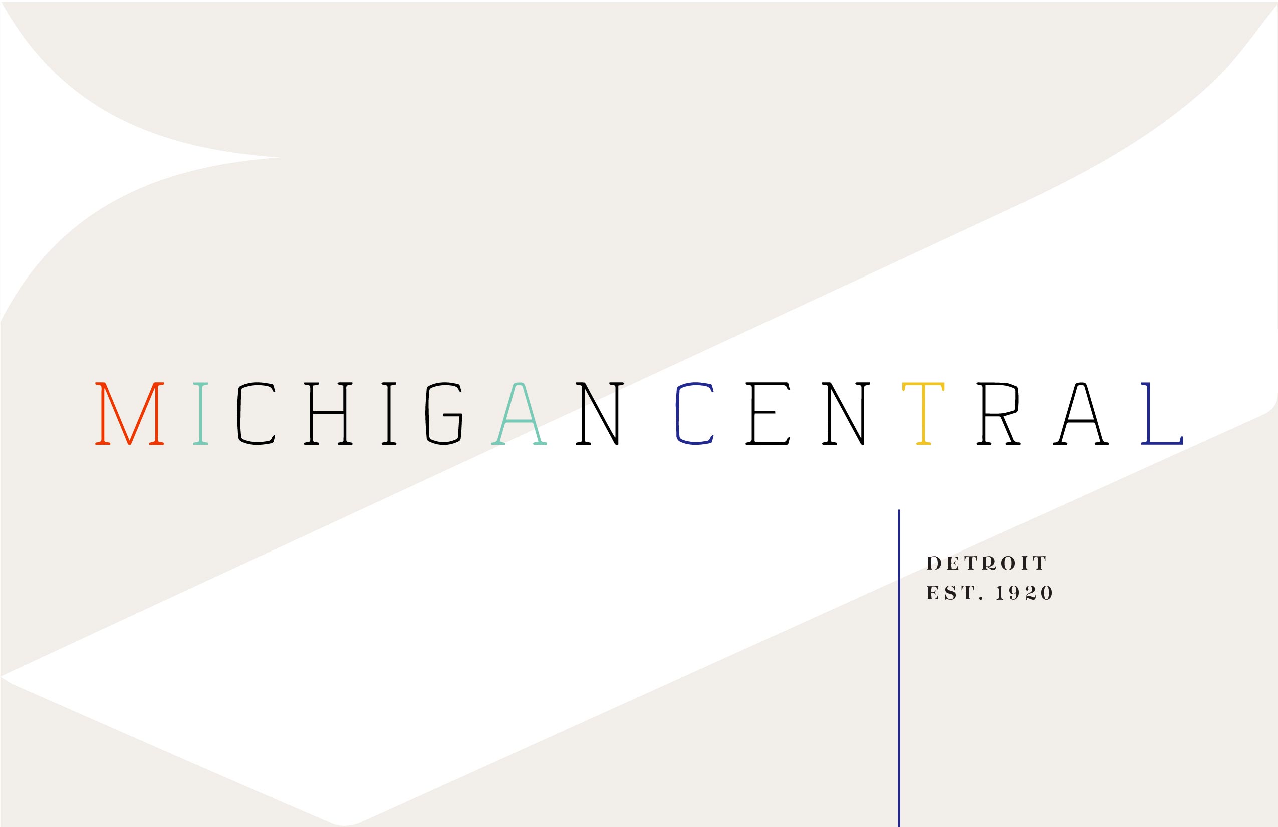
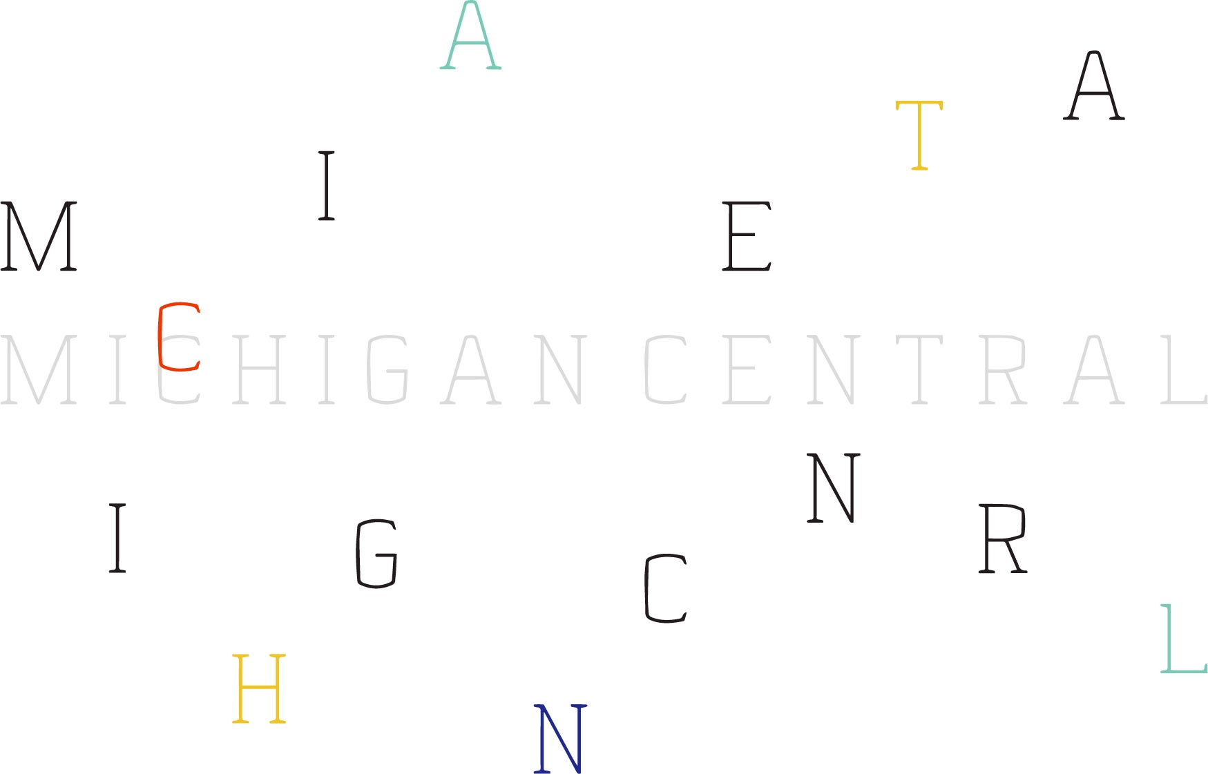
The first branding exploration for Ford’s Michigan Central Station draws inspiration from the landmark’s striking facade. A serif inspired logo and typeface mimic the building’s austeir arches and columns and are also a nod to the transportation and automotive industries’ shared histories in Detroit. The interaction of these elements convey innovation through surprising, delightful movement, like a train leaving a station into the sky.







2
Ford’s recent commitment to producing sustainable electric vehicles and use of self-driving technology demands a visual system that reflects the company’s historic adaptability and future thinking, but differentiates these new advancements as being a part of a new era. My second branding exploration for the company’s new International HQ makes a simple, unexpected change to Ford’s recognizable logo. Simplifying and rotating the Ford oval communicates the company’s expanding vision of the future of automotive tech. Overlaying rotations of the oval onto itself also resembles a globe while also referencing 1960’s space age graphics, a previous time of American optimism and rapid technological advancement.


